Set of blankets with pattern games
From the newsletter, this and more…
Considering the autumn season that makes itself seen and felt and the days get smaller, I leave some space to the ‘house’, also a metaphor of our inner world. From the way we inhabit it we understand the link with our unconscious: too full or too empty, manic or messy, it speaks of us and our lives. You just have to get inside to see each other.
When you meet a new person it would be helpful to visit his house and immediately transcribe his emotions…then becoming useful, marveling at the perspicacity of intuitions promptly removed, not to hinder the illusory opinion that we make of others (from the book ‘Nel cuore delle case’ by Donatella Caprioglio)
Home + furnishing accessory
Every house is never finished (and it’s okay that it is)…we do not stop with the changes changes and movements, the inventory (for those who can) of the present and hidden things. We see that it is never large enough. We continue to take care of the house and our needs: to live it adapting it to us!

The difference of a living space is also the accessories, to be considered not only for the aesthetic appearance. A detail that attracts attention, attracts the eye, takes us emotionally and involves us. The simple addition of colors, which are identified in the patterns of a knitted blanket, can help make us look more cozy and lively room. We make spaces more comfortable and pleasant.
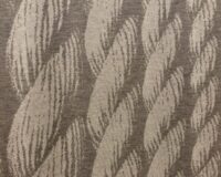
Referring to the color of burgundy, I took as a reference 3 of my blankets that are part of the collection, which I was inspired by thinking of motifs dear to me: flowers and geometries. Patterns that harmonize I like to think starting from a detail, and then represent the whole that determines the theme based on the associated colors. Usually I can imagine, before even seeing the study of the tests (made by the knitwear factory) how it could be the final result.
For the ‘Foliage‘ blanket, I used a black and white anti-stress block design. After putting it on paper (in real size 170 x 210 cm) I chose the jacquard technique, studying the finishes.
With the blanket ‘Crossing‘, in its essentiality of geometric figures, I chose to combine the technique of inlay + stitch processing.
In ‘Beach towel effect‘, I assembled the play of lines, passe-partout element of easy grip.
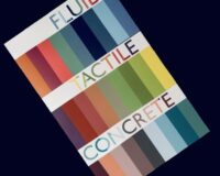
The study and research in the choice of yarn are linked to the final success of the product. Versatile fibers for different solutions, pleasant and soft to the touch. I use yarn dyed, which is important for the solidity and purity of the color. Neutral tones alongside vibrant and luminous nuances. The pleasure of a product with an innovative design that gives a character of elegant simplicity, in an original and durable proposal. I like to inspire and influence with the passion of the beautiful-functional and the mesh in its ductility creates pleasantness, to savor and appreciate relaxing moments in being ‘pampered’! Product safety in a ‘lifestyle‘
The burgundy color
We want to call bordeaux a ‘romantic’ color? Yes! It represents a dark shade of purple, mixing brown and purple. Name that derives from the color of the French wine of the city of Bordeaux. Warm and enveloping, it is not a showy color like Red or Purple, expressing a sensuality thanks to its deep nuance. It’s bold and strong: dark tones mixed with dark reds and purple, give rise to a color that stands out in a context of more intense ranges. It can be used in various shades to create sophisticated combinations. Complex and full-bodied without being oppressive, it works as a unifying element for interior design. For the home it represents a warm and welcoming color, capable of giving the environment an original touch.
Think of it as one of the various autumn shades to match and able to enrich the spaces if well combined not only with materials such as wood or metal but also with other colors that can enhance its characteristics, creating innovative and satisfying effects.
People who prefer this color are strong in character and have a great need to establish themselves professionally and in life in general. They are determined and seek continuous certainties and confirmations both at work and in personal relationships…This colour has always been associated with royalty, nobility and passion. In ancient times I was a sought after and expensive pigment, coming from a secretion of the marine mollusc the ‘murice’. In the society of the past it was loved by the wealthy classes especially in the combination of the fabric like velvet. Still today it is used as a distinctive feature.
Japanese elements in burgundy color
I add a brief consideration by Japanese culture in describing and interpreting the color bordeaux with some symbolic photos, taken from the book ‘The essence of the color of Japanese Design‘ by Rossella Menegazzo
‘What color is Japan? Red like the round of its flag, or like the contour of the lips and eyes on the white foundation of a geisha, like the lines marking the makeup of a kabuki actor, or as the lacquers and pavilions of its sanctuaries? And pink white like cherry blossoms? Blue like the natural indigo of which the most popular garments and fabrics are dyed, or like the decorations of its porcelain and the roofs of the huts narrow between sea and mountains, or even deep blue like the “Great Wave” of Hokusai? Maybe it is purple like the vestments of its Buddhist temples, or like the clothes worn by emperors and nobles? Or black, like the finest lacquers, the ink traced on paper, or the long raven hair traditionally associated with feminine beauty? Anyone who knows and loves Japan, because of reading, studying or traveling, will be fond of one or more of these colors, as each of us recognizes in a particular season…’
According to research, Japan style was the most popular and growing style trend of 2022.
From burgundy to Magenta, the pace is short…and even 2023 has its color, as established by Pantone (in its good marketing action).
Magenta is an interesting red: vibrant in its explosion of energy. As it is a color that does not exist in the spectrum of visible colors. The name comes from the city Magenta (a reference to the battle wanted by Napoleon). From a certain point of view, it is a moment not the most favorable to present this color… it was originally called ‘fuchsine’ from the fuchsia flower.

Intense purple, in Japanese Murasaki, indicates a “deep” or “dark” tone. This colour is obtained by repeatedly dipping the yarn into a root dye (Lithospermum erythrorhizon). In the Heian period (794-1185) only the noble classes could wear the Murasaki, as it was a refined dye and difficult to produce. It is still considered a noble color.
Budoshuiro, is a slightly purple bright red is also commonly called “wine”. The vine is an imported plant from the West and the production of wine began in Japan only in the nineteenth century.
Keshimurasaki, underlines the dull and ashy tone of this purple (Murasaki). In the range of purple, there is also a lighter gray or blacker “ash purple”.

Artista Harriet Parry
A continuous series of miniature flower arrangements
By@harrietparryflowers
www.harrietparryflowers.com