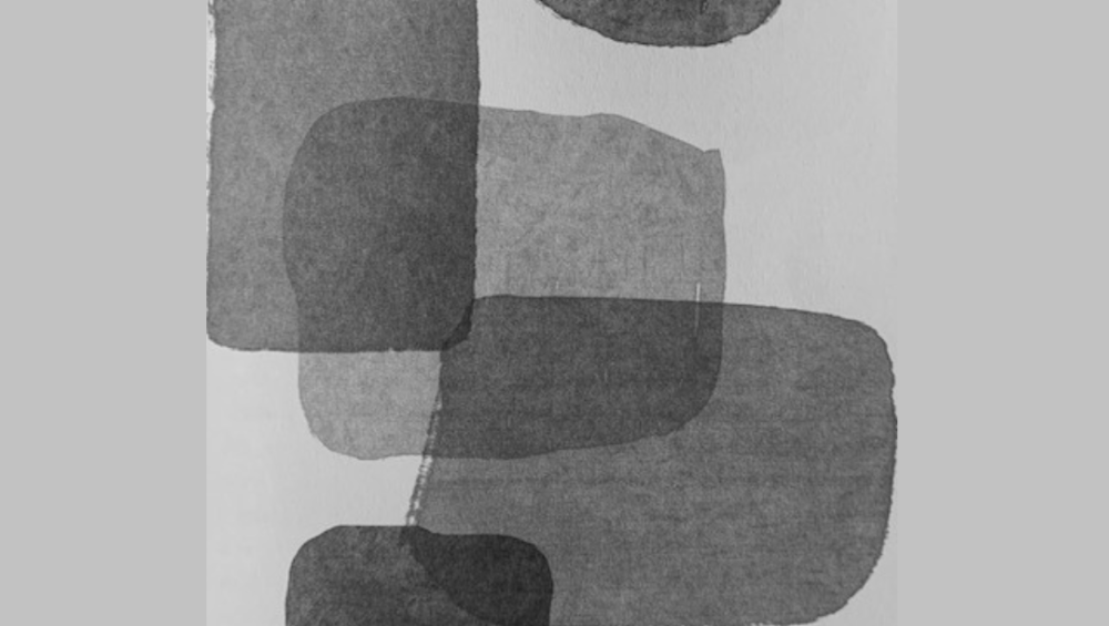
Illustration by Giovanna Ferraris from ‘The world of dots
Gray is therefore not an absence of color: it occupies the spaces ignored between white and black…
I’m writing and, taking my eyes off the page, I look at my house for a moment… I realize that the gray color is present and ‘colors‘ in its own way, various things! But how many shades of gray are there? There are over 50 shades of gray: the infinite scale of gray tones between white and black. It’s a shrinking color, leaving the other colors in the center of the scene.
Grey may be the color of silence. It’s rare that it doesn’t express something beyond itself. Black and white photography has managed to make it the color of colors, although metaphorically it is the opposite: the color of the absence of colors. It’s a state of mind, a way of being, the color of conformity (outer-inner). It can also be boring, anonymous, sad, flat, undefined.
In the field of Design gray is attributed a certain modernity, in its purified and neutral. In its ‘neutrality’ there are warm and cold tones, reinforcing the saturated colors (intensity of a specific shade). Dull or relatively dark desaturated colors (in a subtractive system, you can add gray black white or complementary color) are in the trends of interior decoration, trying to get out of certain schemes chosen. Look at the photos of the first pages of furniture magazines: many are similar, in a common security that conforms to the rules in use. Even in different contexts (with furniture-coverings-objects) comes the welcome of an elegant and plush universe, in the expression of a quiet strength, a refined and refined interior in the demonstration of ‘good taste’. The important thing is not to exaggerate not to make the environments impersonal and cold, as the glossy pages of specific magazines.

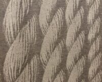
Blankets on armchair: warm grey shades
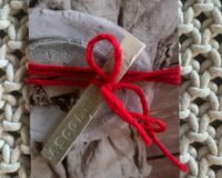
Imperfections determine the charm and give life to things!
A gray furniture (or very desaturated) is suitable for people who enjoy a good balance and who are not looking for stimuli or relaxation; in a gray room you do not rest or regenerate, rather you stay in meditation.
So as a dominant color, it’s not vital. One of the best ways is to associate it with warm materials such as wood and natural stones and furnishing accessories. In interior spaces it tends to appear neutral and free of stimuli, as it does not highlight any element, while it is useful to consider the chromatic grays (with a hint of color).
The various levels of gray are determined by tones ranging from cloudy moonlight to those of steel and anthracite or as absence of color that extends to infinity, clear and smoky as fog, medium as gravel or concrete, Solid and dense dark of some sumptuous surfaces, enhancing the depth. From the darkness of almost black, to the dusk of ash dust.
Let’s think about the use of varieties of names that suggest the multiple shades:
pearl – very light gray, iridescent pink and blue,
gravel – optical illusion of different shades, with the impression that it is a unique color,
obsidian – a glass of volcanic origin (similar to gravel),
Carthusian cheese – (cat) in a grey-blue shade, but also the rat or pigeon,
basalt – a dark g.rock resulting from lava cooling,
graphite – mineral used already in the late 600′ in England and used for pencils thanks to N.J. Contè,
lead – metal used in the design by the Romans,
slate – (I always loved it)
Do not forget the same g. silver that in color theory is considered a gray with metallic brightness, while the opposite, in its opacity, the pewter g.,
melange g.- Melange lends itself well to ‘enliven’ this color. Used in the blend of yarns (both in knitwear and fabric) in different colored fibers, to develop various shades.
Browsing, I found the Payne g., name taken from his creator lived at the beginning of 800, used in painting, replacing black. He was the first to mix a blue-black gray, suitable for depicting the melancholy of distance in landscape painting and considered one of the most beloved pigments by past artists.
Throughout the history of art, the use of gray has been the favorite color. In the Middle Ages it was considered the opposite of black and therefore had a beneficial value in expressing positivity: hope for a better future.
The gray color is the color of the point of view: it changes the meaning depending on how we look at it, precisely because it lends itself to be a point of rest, observation, consideration and evaluation of the surrounding world. It symbolizes calm, giving us a moment to take a breath. The gray zone, neutral zone, the one that represents a middle way. It speaks to us of a suspended moment, of indecision, of waiting.
Like every color, it contains more meanings and how everything has a side of light and a side of shadow. If we associate each color with an emotion or a type of person, we will discover that no one can remain in a condition of gray or long love gray. In our common imagination, black and white represent respectively the bad and the good, the gray middle way between the two, brings us back to the concept of balance.
People think that in France everyone dresses in black; in fact they wear J.P. Gaultier grey
Note: in clothing it is the right color to be noticed ‘relatively’! It is still safe, timeless, elegant, classic and durable, combining with ease.