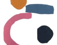
Opera by Louise Bourgeois (untitled)
‘…in the Blue painting of Blue…’, chorus of a famous italian song…
Colors are associated with emotions and these possess their own rainbow and, among all the colors of the spectrum the dominant one is blue, the color of inner life (W. Gass)
How much you use this Color! The Internet itself is a world of blue: FB-Twitter-LinkedIn-Microsoft-Wikipedia, various hyperlinks and many homepages and windows. A random choice that reflects real life. It’s the favorite color of most men and women, regardless of their country. In 2019 Pantone, proposed it as the color of 2020, the ‘Classic Blue’, calling it reassuring able to give a sense of protection solidity and confidence’. Linked to this color there is an interesting discovery: the blind can, through a special receptor, perceive blue light.
It’s particular how in Anglo-Saxon culture, blue has a more or less negative meaning. These are the various expressions of use: ‘blue mood’ mood melancholy or simply ‘blue’, ‘b. funk’, fear blue, ‘b. movies’, ‘blue blood’, ‘b. collar’, ‘b. ribbons’, ‘my b. heaven’, ‘b. balls’…
Today, it is the favorite color in the world, especially in Europe, a consequence of its rise in the Romantic period (in various tones), emphasizes artistic and religious moral social values. It is not a color so present in nature, few plants the flowers the animals the rocks and although we perceive the sea and the sky as such, it did not apply to the ancients. Probably the first to distinguish and appreciate it, were the Ancient Egyptians, through the lapislazulo stone coming from the mountains of Badakshan, (northeast Afghanistan). Egyptian blue is considered the first synthetic pigment produced by men, used to paint ceramics and decorate statues, tombs of pharaohs and wall paintings. Produced in Alexandria, it was then imported and reproduced in ancient Rome by a certain Vestorius, used in Vesuvian painting and in the Roman Empire, it then spread the use in Europe. In Rome, wearing blue meant mourning and bad luck. Its negative connotation was also linked to barbarians (the use of dyeing their bodies in battle). Its consideration will continue also in the Middle Ages, until in the Renaissance with the painting (made possible by the same religion) will be enhanced a tone of b., the blue overseas.
Blue helps us to look deep, to make clear what our values are and to look our truths in the face

The ultramarine is considered for centuries the “true and best blue”. Its price rivaled that of gold, is used only in the most valuable works of the rich patrons (especially in the mantle of the Madonna). That’s why painters turned to azurite.
At the same time, Han Blue was produced in China, while in Meso-America Maya Blue was used: it was made of indigo, an organic pigment obtained from the leaves of some legumes, mixed with clay and heated.
Indigo – was already employed by Egyptians, Etruscans and Romans to dye fabrics, continuing to use it even in the Middle Ages. In 1880 the natural dye was replaced by the synthetic dye, still used to dye blue jeans. It has recently been discovered that it can also be produced by the bacterium Escherichia coli: called organic indigo, it could be an important element of the textile industry in the coming years.
Tuareg – ‘blue men’ nickname given to the Berber shepherds who, moving in the Sahara Desert and wearing blue turbans for protection in the sun, which at the contact of sweat, the blue leaves investigate shines on the skin.
Bonnet -‘blue bonnet’ comes from a plant of large inflorescences, widespread in the wild prairies of Texas, then became emblem and baptized with this name because it resembled the shape of the headdresses of the pioneers, to the conquest of the West.
Prussian Blue – is the most important after the overseas. It was discovered by chance in 1706 in Berlin, by the manufacturer of pigments, the Swiss Johann Jacob Diesbach. It was used to dye fabrics, especially military uniforms, both of the Prussians and of the Napoleonic armies (in France called bleu National). It was considered by various painting artists such as Pablo Picasso in his ‘blue period’ and the Japanese Hokusai in the ‘Great Wave of Kanagawa’. Used in cyanotype (one of the earliest methods of photographic printing) as well as by architects, to reproduce plans for technical drawings and photographs said for this blueprints, a term that today indicates a scheme to follow, a trace.
With the Blue Klein, the b. oversea took an extra step. In the 1950s the French painter Yves Klein developed an opaque version, which he recorded in 1960 under the name International Klein Blue, IKB: it became his trademark. Its ‘robust and exuberant’ blue contrasts with the soft, melancholic and desperate blue of P. Picasso. One of the most famous and touching uses of IKB is the film ‘Blue’ by Derek Jerman, which shows for 75 minutes the same nuance accompanied by monologues, dialogues and an arrangement.
The YInMn, the last blue, was discovered in 2009, named for the initials of its components: (for yttrium, indium, manganese) was obtained by Andrew Smith. It was then patented in 2012 and has since been used for outdoor use, before being approved for general use by the US Environmental Protection Agency in 2020, under the name Blue 10G513. The company Crayola has put on sale a pastel of YInMn blue called Bluetiful, a play on words between blue and beautiful (beautiful, in English). It is a b. pure, without addition of white or black pigments, it is very stable resistant and free of toxic components.
In short, BLUE is the creative color par excellence! It represents evasion, symbolizes freedom and evokes a sense of fullness and harmony with the surrounding environment. There is the vastness of the blue of the sea that with the horizon cuts that of the sky (or on the contrary), to a journey, to freedom, gives us concentration and inner balance. It’s positive and intense, soothing and invigorating, it’s the color most often associated with a sense of confidence, stability and competence. It is also the basis of many shades, in fashion (full pinstripe, uniforms of colleges, blue-jeans…) as in the decor. The sapphire blue makes the living area special, the furnishings and accessories; in the most dusty shades such as sugar paper blue is of great aesthetic impact in the bedroom where it fits with sleep and relaxes.
However, it is also interpreted in its classical neutrality, it has its own charm and determination, something magical and noble, and for me it is the color that I never associate with bad taste!


